Value shows the current CFS. Small number with arrow shows the trend. Chart shows the last ~2 days (raw + 1-hr MA).
Historical context. Historical plots.
Questions I have: what is the annual water usage to the front range
Story content goes here.
Add some photos/ quotes like a news story?
Ideally there are some more interactive features in each section, like graphs of historical flow data that a user can mess around with
Downstream context.
Here the Roaring Fork meets the Colorado; temperature, sediment, and habitat. good place to tie together upstream influences. NICK???
How do we tie all of this into the Shoshone call? Maybe we create our own visual like the faucet analogy, then present some historical data, then talk about the current news about the Permanency project. We can end the map here and go onto a more creative/visual section.
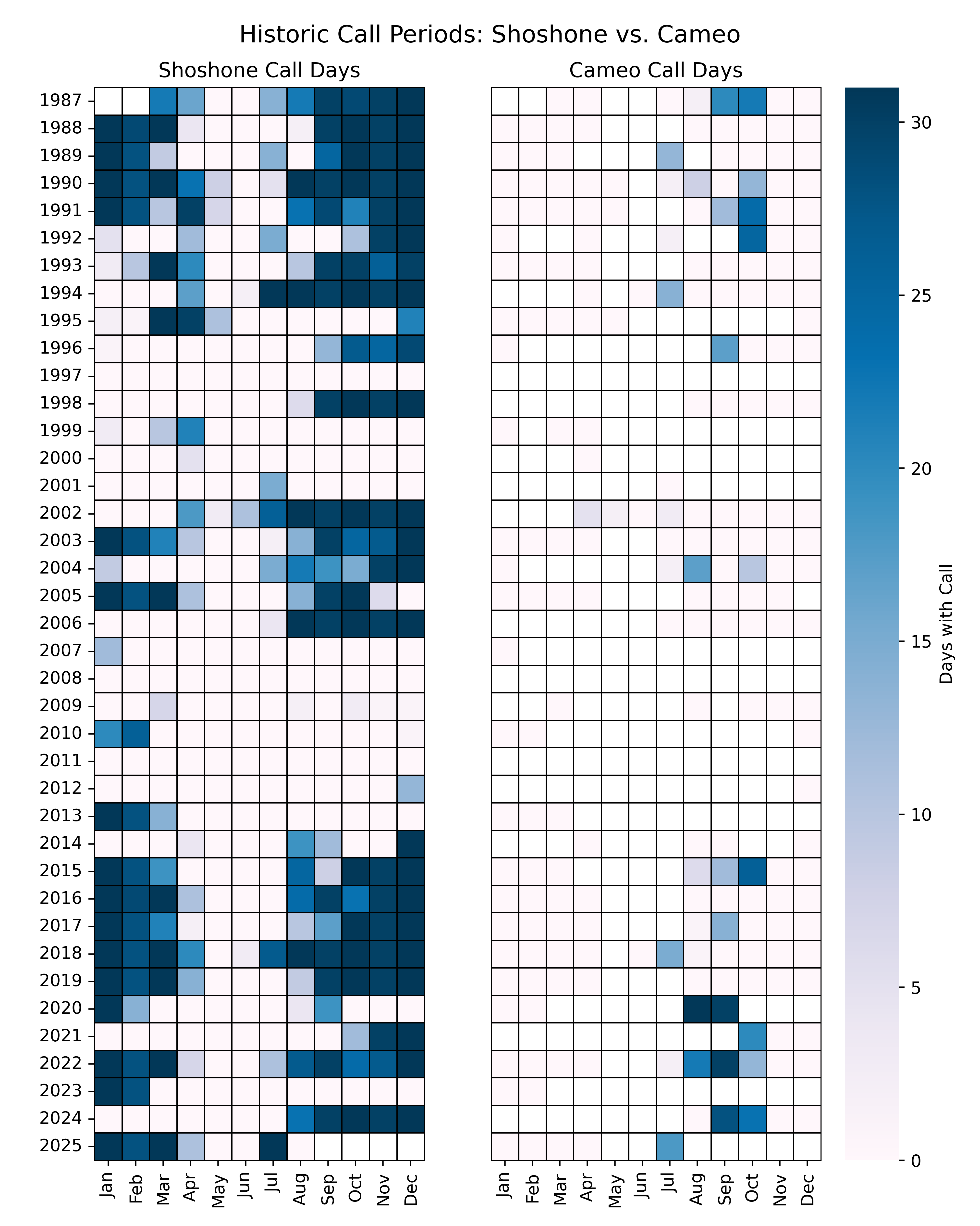
I think this is going to be the crux because it is hard to conceptualize